Gray and neutral
Simple, minimal, and flexible. This is the safest default when consistency matters most and the headshot needs to work across LinkedIn, company bios, internal directories, and press use.
Background options
A background is part of the visual standard, not just the space behind the face. The right direction helps a team page feel unified, keeps LinkedIn crops clean, and gives each real, live-directed portrait enough room to work across company bios, recruiting pages, press materials, and internal directories.
Background direction is chosen before the session, applied live by the photographer, and finished in editing — included at $180 for one person and $100 per person for teams of 3+, with finals in two business days.
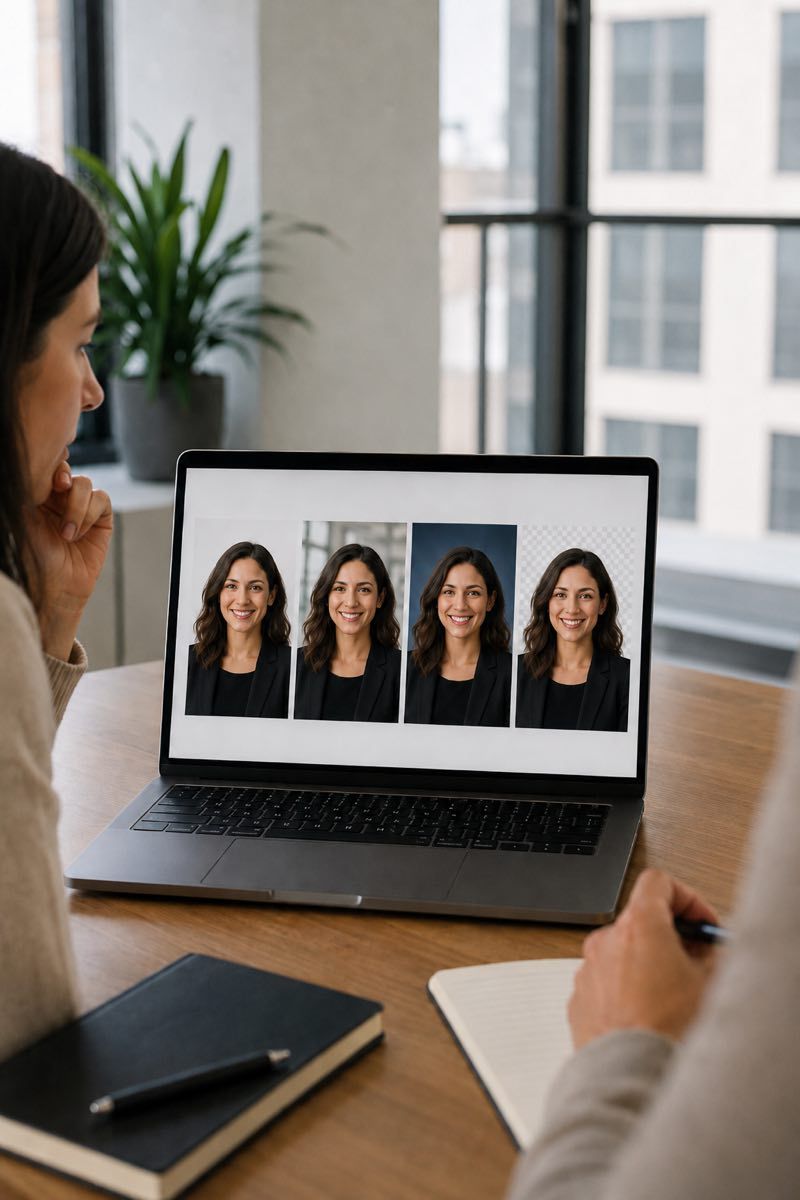
Background affects how quickly the face reads, how polished the image feels, and whether a full team grid looks intentional. In a remote session, the photographer helps adjust framing, distance, light, and room choice before capture so the setting supports the person instead of competing with them.
Background affects:
For teams, the background also shapes:
For team-page context, see company website headshots, LinkedIn headshots online, or headshots for remote teams.
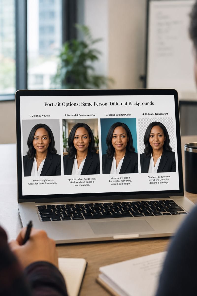
A plain, evenly lit wall in a neutral tone is the safest choice, because it reads cleanly at thumbnail size and matches across a team. The four workable directions are clean neutral, natural environment, branded or digital, and transparent cutout. Pick one before the first session and keep it.
For color-by-color detail and example setups, see which background colors actually work.
Most remote headshot backgrounds fall into one of four useful categories. The right choice depends on where the image will live, how much consistency the team needs, and whether the background should stay invisible or support the brand.
Simple, minimal, and flexible. This is the safest default when consistency matters most and the headshot needs to work across LinkedIn, company bios, internal directories, and press use.
A real office, home office, coworking space, or workspace used intentionally. This can feel warmer and more editorial when the room is calm, uncluttered, and framed with care.
A controlled look that supports a visual system through tone, color, or subtle digital treatment. This works best for companies with clear brand direction and should not feel like a logo wall.
A flexible output for design teams that need to place headshots on different layouts. It can be useful for decks, press kits, and speaker pages, but it depends on clean capture and careful editing.
The safest default for most professional headshots.
A clean neutral background keeps attention on the person and makes the final image easy to use almost anywhere. It is usually the strongest choice for teams because it creates consistency without asking every participant to have the same room, office, or lighting conditions.
Best for:
Trade-offs:

Real space, intentionally framed.
A natural environment background uses a real room with controlled framing so the space reads softly behind the person. It can be an office, home office, studio, coworking space, or another calm location that adds context without pulling attention away from the face.
Best for:
Trade-offs:

A controlled look aligned to the brand.
Branded or digital backgrounds should support the company’s visual system without overpowering the person. In most cases, this means a brand-aligned tone, subtle gradient, or controlled color direction rather than a logo placed directly behind the head.
Best for:
Trade-offs:

A white background is the most predictable choice on a web page: it drops out against a white team grid, it never competes with a name or a title, and it stays readable at thumbnail size. It is also the hardest of the four to produce in a room that is not a studio. A wall that looks white to the eye photographs gray or cream unless it is lit separately from the person, and pushing it back to white in editing tends to take the edge of the hair and shoulders with it.
In a remote session the workable version is a light neutral wall, evenly lit, finished to a consistent tone across the whole set — which reads as white in a grid without the flattening that comes from forcing it. If the brand genuinely requires a pure white field behind every person, say so before the first session, so the direction and the editing standard are set for it from the start rather than applied afterwards.
Useful when downstream design needs flexibility.
A transparent or cutout output removes the captured background so the headshot can be placed into different layouts. It is useful for design teams, but the quality depends on capture conditions as much as editing. Hair, glasses, translucent fabrics, and low contrast edges all affect how natural the final result can look.
Best for:
Trade-offs:

For LinkedIn-specific framing, see LinkedIn headshots online. For team-page assembly, see company website headshots.
A team grid starts to look mismatched when some people are photographed on neutral backgrounds, others in real environments, and others on branded or cutout treatments. For team rollouts, we keep the background decision simple and intentional.
In a company programme the background, crop and image ratio are approved once, at setup, and that brief travels with every invitation — including the sessions you add for later hires. Neutral, natural-environment, brand-colour and transparent-cutout options are all available; which of them your programme includes depends on the package and brief you agree. See selection and delivery.
Retouching can refine a good background. It can clean color, soften small distractions, reduce dust or fold lines, and remove minor accidental objects in the frame. It should not be expected to turn the wrong background into the right one.
The cleaner the capture, the more editing can focus on tone, finish, and consistency instead of rescue work. This is why background direction is handled before and during the live session, not only afterward.
For the editing philosophy, see retouching standards.
Background questions
A clean neutral background is usually the safest choice. It reads well at thumbnail and full size, works across light and dark website layouts, and keeps attention on the face. Most teams should start here unless there is a clear reason to use an environmental, branded, or cutout direction.
Usually no, if the goal is one consistent team page. Different backgrounds make the final grid feel patched together. A company can use separate directions by department or campaign, but that should be an intentional brand decision rather than a personal preference for each participant.
Sometimes, but it depends on the capture. Clean background replacement needs good light separation, visible hair detail, and a background that does not interfere with the subject’s edges. It is more reliable to choose the right direction before capture than to fix the background afterward.
Branded backgrounds can work when the company has a strong visual system and the treatment is subtle. They are not always the best choice. Heavy color, graphics, or logos can compete with the face and may date faster than a neutral background.
The photographer will help find the cleanest available angle during the live session. Small changes in position, camera height, distance from the background, and light can often make a room feel much calmer. If the space is too distracting, a neutral or digital direction may be a better choice.
Use a transparent or cutout background when the final image needs to be placed into different layouts, decks, press kits, or event pages. It is usually best as an additional output rather than the only version, because a standard finished background often feels more natural for everyday professional use.
Pick the direction
Bring a preferred background direction if you already have one. If not, we will help choose the cleanest option for your use case, then guide the participant during the live session so the final image works with the intended visual standard.